The Transbay Terminal, dark and uninviting though it may be, is downtown San Francisco’s hub for regional bus lines that connect the city to the counties lying east, south, and north. Many Muni buses also terminate at Transbay, and the terminal is just a short walk from a slew of other bus and train lines running on and under Market Street. As such, you might expect to see many clearly labeled maps of the various services located in or near the terminal, kept meticulously up-to-date, so that riders can make smooth transfers and make their way to their destinations as efficiently as possible.
But hey, this is the Bay Area. Since when has transit here worked the way it should?
Instead of meticulously updated maps, one instead finds a time capsule of sorts, a treasure trove of outdated maps — some rather obscenely so — chronicling a mini-history of service to the Transbay Terminal. The geek in me loves this sort of thing, so here you are reading a post about it. As usual, full-sized versions of all these maps are hosted on my Flickr account, so please click through any image you’d like to see in close-up detail.
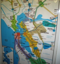
One map posted in the Transbay Terminal (pictured at right) shows the entire Bay Area region, clearly displaying our decentralized patchwork quilt of transit agencies. Unfortunately, the design is hideous, and the map doesn’t make particularly clear how one might transfer from system to system, or what the level of coordination is between transfers. In short, the map simultaneously contains too much information and not enough information. It is also shows BART’s terminus on the Peninsula to be Colma, thus not conveying the quite important piece of information that since 2003, BART has terminated at Millbrae, not Colma, and also provides direct service to San Francisco International Airport.
A portion of the bus stop map which indicates a stop for the now-retired 15-Third bus,

but this error is less egregious, since that bus was running up until just a few months ago. Then again, how can we expect the map to acknowledge the removal of the 15, when it also labels the 32-Embarcadero bus,
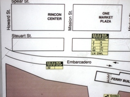
a line that was disbanded several years ago when its route was absorbed by historic streetcar and Muni Metro extensions. The above picture also suggests that the 66-Quintara bus still runs downtown, something which may surprise its riders.
Another map:
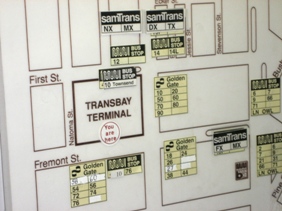
The 12-Folsom line no longer stops where this map suggests. As for SamTrans, I don’t think the TX even exists anymore, let alone serve the terminal, and the map doesn’t acknowledge the PX or RX lines. A quick check of the recent Golden Gate Transit map (PDF) of this area shows several additional errors.
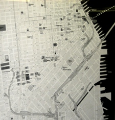 Perhaps the most amusing map of all is the map of San Francisco depicting the current state of freeways… current, that is, if the year were 1989, and the Loma Prieta earthquake had not yet hit. The map shows two fingers of freeway poking north of Market Street. On the right side of the picture is the Embarcadero Freeway, which connected drivers coming off the Bay Bridge to Chinatown and North Beach, but in doing so, separated San Francisco from its waterfront. On the left side is the Central Freeway, which once cast its dark shadows all the way to Turk Street. Probably the best thing about the Loma Prieta Earthquake was that its force damaged both of these stretches of freeway; the structures either had to be fixed or removed. Luckily, the city chose the second plan of action, in a momentous, more recent victory for the infamous Freeway Revolt that started a few decades earlier. Since then, San Francisco has since been reunited with its waterfront; where the ugly, noisy Embarcadero Freeway once stood, the sun now shines (from time to time, anyway) on pedestrian plazas, a historic streetcar line, and a revitalized waterfront and Ferry Building. In the meantime, the Hayes Valley neighborhood, once viciously cut in half by the Central Freeway, is still in transition, since the final work associated with retreating that stretch of freeway to Market Street only finished in 2005. Hayes Valley has already enjoyed some of the benefits associating with tearing down the freeway, and we can look forward to increased vibrancy as empty parcels once occupied by freeway are replaced by new apartments and neighborhood shops.
In any case, neither freeway currently exists, as these Transbay Terminal maps would have us believe. At least the terminal will be demolished in the next couple of years, and if we’re lucky, the new Transit Center might just have updated maps. Check out the time capsule soon, before it disappears!


Those bus stop location maps at the Transbay Terminal were from the early 1990s post Loma Prieta in 1989. The Samtrans TX has been eliminated since 2002.
Posted by Sin Ching (Michael) Ip | 6 October 2007, 7:24 pmYes, the freeway map is necessarily pegged to being very early 1990’s, since the Embarcadero Freeway wasn’t demolished until 1991. A couple of the maps posted in the terminal were actually changed very recently, which was nice. Thanks for filling in the year when the TX was eliminated.
Posted by Eric | 6 October 2007, 7:58 pmA reader writes in with a glimpse of another old San Francisco map:
“You can see an old SF map in the Star Trek IV trailer at 1:23
http://www.youtube.com/watch?v=4bzCbT9tY2Y&feature=related“
Posted by Eric | 19 April 2008, 5:59 pm