To start, I would like to wish all readers a happy Pi Day. (This post was published at 1:59 pm with good reason!) But now, onto the real business of this post.
It is hardly news that Bay Area transit websites are, on the whole, rather lackluster. The 511 Transit Planner has the benefit of covering for the Bay Area’s large collection of transit agencies, but it is sometimes slow and unwieldy, or it offers an inadequate trip path that is based on often fictional bus schedules. And no doubt you have run into the highly colorful vomit officially known as the SF Muni System Map, a document that is confusing enough that you practically have to know the whole system in advance just to follow it. I’ve wondered how many potential riders are sufficiently put off by navigating transit websites that they just decide to just drive instead.
What if you don’t want a whole trip planner? Wouldn’t it be nice to just type in your destination address on Google maps, and not only be able to get a feel for the location via Google Street View, but also see the exact corner where you can hop onto the closest accessible transit option? Or, wouldn’t it be nice to click on a train station icon and see a complete listing of all trains and buses — from any transit agency — that you could easily transfer to, and be just one click away from seeing the route of those transfers, with each and every stop mapped out? Why, yes, you might say.
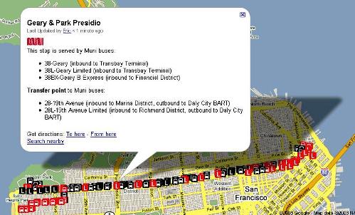
I agree, and so this is the start of a (potentially long-term) project to create maps, using the Google interface, of transit stops in the Bay Area, ranging from major train stations to minor bus stops. Each stop is labeled with basic information: the buses or trains that stop there and the direction the transit vehicle is headed, as in the above image. In all instances, the precise location of the stop is marked (not merely the relevant intersection), and where necessary, other useful facts are added: e.g. transfer points, whether the stop is on the curb or on a traffic island, which surface light rail stops have accessible platforms, whether the stop receives limited bus service, and so forth. In other words, the goal is to give riders the opportunity to master the “transit terrain” of the area surrounding their destination, even if they have never visited that location before. I believe that this sort of tool could be more useful than a trip planner for many transit riders, but we will see if that is actually the case.

For train stations of regional importance, additional information is provided as to which neighborhoods are easily accessible with a single transfer from that station. Users can superimpose route maps on top of each other to figure out the easiest way to execute a transfer — for example, the above map, which superimposes the 38-Geary Muni bus on top of the BART system map. Of course, because the maps are integrated with the Google Maps interface, you can type in an address and find out exactly where to access transit near your destination. The hope is that these maps will help to remove some of the discomfort people might experience when traveling to less familiar destinations, and to encourage new and infrequent riders to leave their cars at home more often.
Also, because an eventual goal might be to expand this into a regional tool, the information provided would not be agency-specific. If a particular bus stop happens to be served by three transit agencies, a rider would know with a single click which agencies and which bus lines serve that stop, without having to visit three different websites or call three different phone numbers to discover that information. Transit agencies across the Bay Area tend to operate as separate kingdoms, rather than as units within a greater regional network, but these maps could help demystify that network and clarify the connection points that do exist.
To see the maps that are currently available, click here, or click the “Bay Area Transit Maps” link in the “Supplements” section of the sidebar. Right now, the BART map and a few popular Muni lines have been posted. A couple AC Transit lines will be coming next, so that folks in the East Bay can get in on the fun. This is a soft opening to test the waters — even on the maps currently made available, I still need to finish filling in the transfer information, particularly for Market Street, where every stop has a slew of of transfer options. Also, the transfer links on each individual stop are mostly incomplete, because not all the maps have been created yet. This transfer cross-links will become increasingly complete in time.
If feedback seems generally positive, and if the maps are reasonably well used, I will probably add more in the future and announce those additions here on the blog. I would like to leave the comments section of this post free for more general commentary, but if you notice a specific map error that needs to be fixed, please email me.


I am thinking whether there’s any coordination opportunities with the Transit wiki project: http://copy2000.net/test/Main_Page
This wiki can display Google Map KML files.
I am wondering whether you have to manually edit the transfer infomation on the map.
Posted by Andy Chow | 15 March 2008, 6:44 pmIntegrating these into a wiki is definitely an interesting idea, maybe to establish some context. For instance, someone wouldn’t be able to load every single map simultaneously, so to supplement it, I was going to put together a neighborhood guide of sorts. So that even if you didn’t know which lines went where, if you at least know which neighborhoods you intend to travel between, then you can just add the lines that would be of interest. That sort of thing could fit well into a wiki.
The wiki you linked: isn’t that the one Jamison set up awhile back, or is it another one? It looked familiar, and I think I created an account on that but never actually posted. These transfers here I’ve done manually, but some sort of automation certainly seems like it should be possible as well — and especially helpful on places like Market Street.
Posted by Eric | 15 March 2008, 6:49 pmIt was a new version to what Jamison created a while back. I need a new version so I can integrate Google Maps and other extensions.
It is a temporary situation. I am planning to get a new account soon with a new domain name.
Posted by Andy Chow | 15 March 2008, 8:29 pmWow Eric! This is definitely a step up from even google’s own offerings in my opinion. I’ve been looking for something like this for quite some time.
I was thinking rather than burdening you with data entry, perhaps you could figure out a way to either provide a tool to enter data and allow others to contribute (with some sort of editor’s “approve/deny” function on your end) or just provide a tutorial for others to create these map ponits and let the masses go to work.
Posted by Tommy | 17 March 2008, 9:56 amTommy, glad you’re enjoying the maps. I guess there’s a bit of a trade-off in that these maps don’t offer schedule information or a planner as Google’s offerings do (not that schedules are especially relevant now, at least for Muni). But the emphasis is a little different, I guess.
Yeah, I was thinking a collaborative effort could be quite useful, especially since this sort of tool is easily expanded to any agency around the Bay. Incidentally, it’s easy with MyMaps, which includes collaboration for anyone with a Google account. But it’s been useful to spend time to standardize what things should look like.
P.S. Sorry it took a day for this comment to go up. I’m not sure why the spam-catcher thought your comment was spam, since there wasn’t even one link, but hopefully it shouldn’t happen again.
Posted by Eric | 18 March 2008, 6:17 pmHi folks. I have KML maps of several Muni lines, including the 1 and the 1 Express lines, the 38 and 38L, and a few others. How can I contribute them?
Posted by Jeffrey W. Baker | 19 March 2008, 11:54 amHi Jeff, I’ve got a lot of Muni lines beyond those here that are partially or largely complete, but it’d be great to take a look at what you’ve done and see how it could be incorporated. Can you drop me an email? (There’s the contact form, or you could also just send it straight to the Gmail address I used to reply to your Ecker email.)
Posted by Eric | 19 March 2008, 12:15 pmLove it! You’re absolutely right about people not taking transit just because the maps/websites aren’t easy enough to use. When you think of it that way, maps like this are incredibly lucrative investments.
It would be nice if the labels could differentiate between inbound and outbound stops, by the way.
Posted by Wes | 26 March 2008, 11:10 amThanks for writing in, Wes — very glad to hear you like the maps.
Regarding the stop labels differentiating inbound/outbound: the reason why that wouldn’t always work is that certain stops have both inbound and outbound buses. For example, the stop on O’Farrell between Taylor and Jones is used by inbound 38 buses, but by outbound 27 buses. And a bus stop could also be served by multiple transit agencies (e.g. GGT and Muni joint stops), but other agencies don’t use the inbound vs. outbound terminology. The stop could be labeled differently for different lines, but I wasn’t sure if that would just confuse the issue, to see an “Inbound” label, but with some buses labeled as “outbound” in the description. Then again, maybe it would be clearer: I’d be interested to hear other’s thoughts on this.
Posted by Eric | 26 March 2008, 11:13 am